


Don't Like - Bullshit Logo Reasoning

Sometimes it feels like the graphic design profession spews bullshit just to see if anyone is paying attention.1 For instance, when the Los Angeles Clippers unveiled their new logo, they had a dedicated slide in their presentation explaining all the little details you can find in the new Clippers logo that you never would have thought about on your own. Mind you, the new logo is pretty uninspired. It’s a big mishmash of a ship in a compass inside a “C” inside a circle. Does it scream, or even say, basketball team? Not really. If you had no idea who the Clippers were, you might think was a logo for a new yacht company/real estate firm. Did you immediately notice that the “N” in “Los Angeles” is positioned dead center about the north marking on the compass? Now that you know, do you care? I don’t—and not just because I root for the Lakers (as all real people from Los Angeles do). It’s just a sad weird boring logo and no amount of design intentionality will make it better. It doesn’t matter how many reasons there are for something if that thing still isn’t good. This is a point that seems to be lost within some sectors of graphic design.
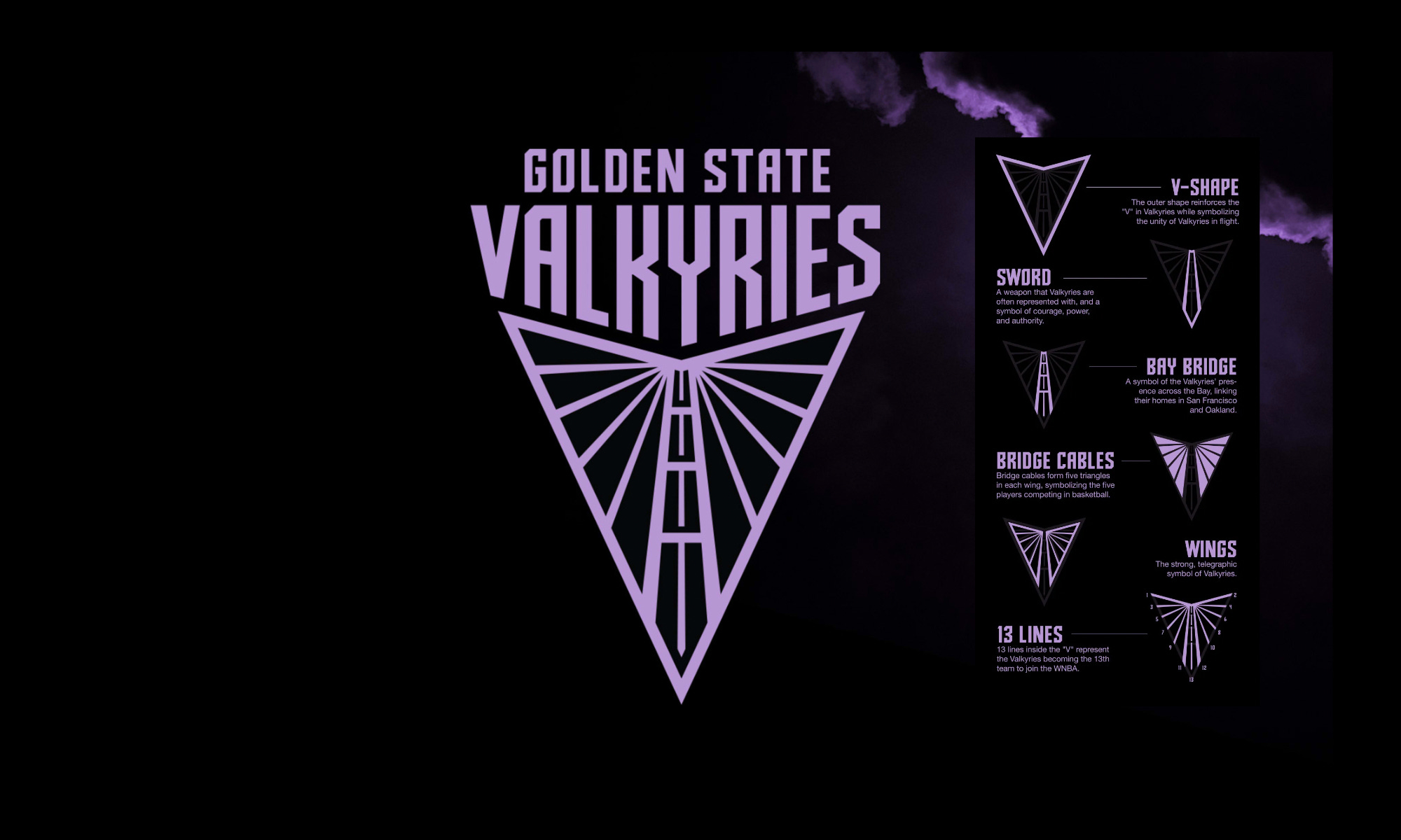
Take the new Golden State Valkyries2 logo. It’s a confusing mess of geometric shapes buried within one another. Again, ask yourself: Is this a logomark of a basketball team or a new subdivision at Palantir? Or is just a wider version of the Pontiac logo with a bunch more lines drawn inside? Did you get that the logo has references to bridge cables and wings? Do you spy the sword in the middle of the bridge cables and wings that also straddles the Bay Bridge? Or did you think it was a necktie? Either way, what does any of that have to do with basketball? I appreciate they want to pay respect to the city they’re based in, but did anyone at any point stop for a second to say, “Hmm, maybe we’ve just invented a bunch of nonsensical reasons for why this thing looks the way it does?” Or perhaps all the reasoning was done post facto as the design team sifted through endless iterations in their Adobe Illustrator files? However the reasoning transpired, it doesn’t justify the logo having nothing to do with the Valkyries being a basketball team. Maybe I’m some kind of ultra moronic hyper literalist but all the best basketball team logos either have a basketball or are a fun graphic representation of the team name. Take a look:

This is the kind of thing that feels like it shouldn’t require an explanation. And yet… here we are with some modern logos that are drab as can be because they’ve got the game twisted: this shit is checkers, not chess.
The most infamous example of this tomfoolery is Pepsi’s iconic 2008 rebrand document, which has been widely shared and laughed at by people all over the world—none of whom seem to work in design. Have a looksee and enjoy :)
For a fun breakdown and discussion of the Golden State Valkyrie’s name, check out this post by Nancy Friend “Word of the Week: Valkyrie.” And then consider subscribing because her Substack Fritinancy is great!